Create UpSet Plot of Enriched Terms
UpSet_plot(
  result_df,
  genes_df,
  num_terms = 10,
  method = "heatmap",
  use_description = FALSE,
  low = "red",
  mid = "black",
  high = "green",
  ...
)
Arguments
- result_df
A dataframe of pathfindR results that must contain the following columns:
- Term_Description
Description of the enriched term (necessary if
use_description = TRUE)- ID
ID of the enriched term (necessary if
use_description = FALSE)- lowest_p
the highest adjusted-p value of the given term over all iterations
- Up_regulated
the up-regulated genes in the input involved in the given term's gene set, comma-separated
- Down_regulated
the down-regulated genes in the input involved in the given term's gene set, comma-separated
- genes_df
the input data that was used with
run_pathfindR. It must be a data frame with 3 columns:Gene Symbol (Gene Symbol)
Change value, e.g. log(fold change) (optional)
p value, e.g. adjusted p value associated with differential expression
The change values in this data frame are used to color the affected genes
- num_terms
Number of top enriched terms to use while creating the plot. Set to
NULLto use all enriched terms (default = 10)- method
the option for producing the plot. Options include 'heatmap', 'boxplot' and 'barplot'. (default = 'heatmap')
- use_description
Boolean argument to indicate whether term descriptions (in the 'Term_Description' column) should be used. (default =
FALSE)- low
a string indicating the color of 'low' values in the coloring gradient (default = 'green')
- mid
a string indicating the color of 'mid' values in the coloring gradient (default = 'black')
- high
a string indicating the color of 'high' values in the coloring gradient (default = 'red')
- ...
additional arguments for
input_processing(used ifgenes_dfis provided)
Value
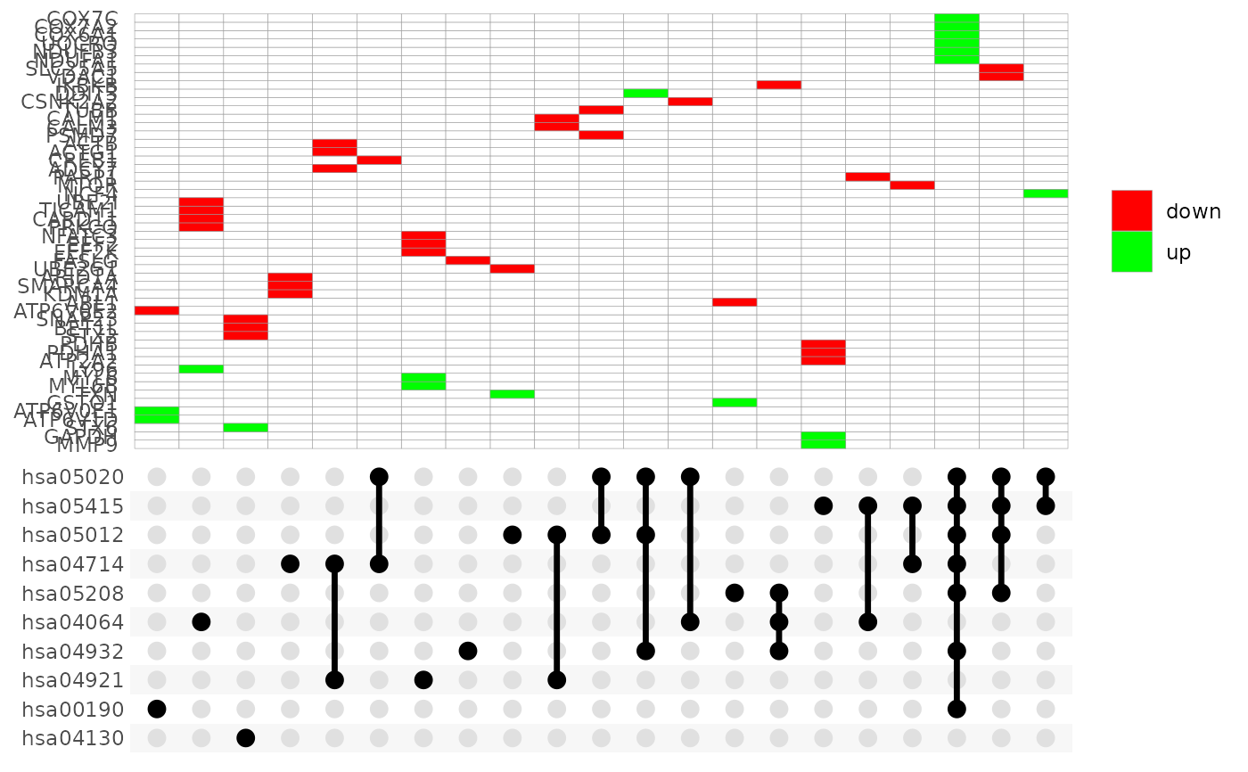
UpSet plots are plots of the intersections of sets as a matrix. This
function creates a ggplot object of an UpSet plot where the x-axis is the
UpSet plot of intersections of enriched terms. By default (i.e.
method = 'heatmap') the main plot is a heatmap of genes at the
corresponding intersections, colored by up/down regulation (if
genes_df is provided, colored by change values). If
method = 'barplot', the main plot is bar plots of the number of genes
at the corresponding intersections. Finally, if method = 'boxplot' and
if genes_df is provided, then the main plot displays the boxplots of
change values of the genes at the corresponding intersections.
Examples
UpSet_plot(example_pathfindR_output)
#> Warning: Using `size` aesthetic for lines was deprecated in ggplot2 3.4.0.
#> ℹ Please use `linewidth` instead.
#> ℹ The deprecated feature was likely used in the ggupset package.
#>   Please report the issue at <https://github.com/const-ae/ggupset/issues>.
